Leanne Nelson+ by | Dec 1, 2014 | Gallery, Websites
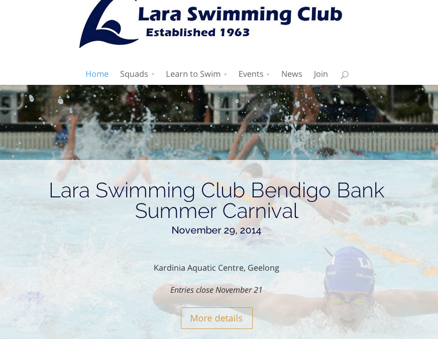
We’ve recently finished Phase 1 of the Lara Swimming Club website update. This update included a complete design overhaul of the local club’s website to make it more usable & useful. The end result – an attractive, responsive site that’s easy for the club to maintain, that highlights their services & benefits, is useful to members & presents the club well to the swimming & local communities....

Leanne Nelson+ by | Sep 2, 2014 | Websites
Website user experience. It impacts how many people sign up for your e-newsletter. It impacts your bounce rate. It impacts whether anyone sees that awesome offer you’ve spent a gazillion hours working on. So what, exactly, is it? What is user experience? Website user experience: A person’s behaviours, attitudes, and emotions about using a (website). User experience includes the practical, experiential, affective, meaningful and valuable aspects of human-computer interaction and product ownership. Wikipedia In short, poor website usability equals poor experience, which equals poor results. How can you ensure your website performs well in the user experience stakes? Keep an eye out for these 10 common mistakes. 1. Calls to action are lost A website has a goal, a reason for existing. It might be to entice visitors to call you, capture email addresses via a sign up form or to directly sell products. Whatever the action you want someone to take, it should be easily identified and accessible to visitors. Not buried amongst Adsense ads. Not in teeny text at the bottom of the page. And certainly not non-existent! 2. Navigation makes no sense Using a website without clear navigation is like trying to get to get to Manangatang without a map. You might succeed, but chances are it’ll take you a whole lot longer than it should and you’ll be cranky when you get there. You might even give up and go to Bendigo instead. You have the map for that trip. Making your website visitors work to find something is a sure fire way to turn them away. In short, poor website usability equals poor experience, which equals poor results. Click...

Leanne Nelson+ by | Jul 29, 2014 | Gallery, Websites
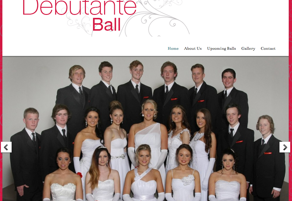
The committee from St Anthony’s Debutante Balls, a major fundraiser for a local primary school, were looking to increase the awareness of their events in the local community. We worked with the committee to create a simple website that provides basic information and showcases the professionalism of their balls. Congratulations to the St Anthony’s Lara Debutante Balls committee on the launch of your new...

Leanne Nelson+ by | Jan 20, 2014 | Gallery, Websites
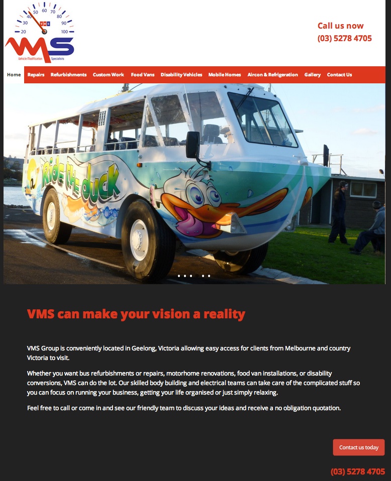
VMS (Vehicle Modification Specialists) is a Geelong company that works wonders with cars, trucks, vans, buses, in fact anything automotive. They are super passionate about their work, and I was really excited to work with them updating their website. They were after something that provided more emphasis on displaying the fantastic vehicle modifications they undertake, as well as a cleaner, more modern look for their site. We talked about the advantages of creating a responsive website (one that changes depending on the viewing device), as many of VMS’s clients are out & about a lot of the time. This ensures that no matter whether they’re on a desk top computer or a smart phone, people can effectively use the website. Again, I built the site using WordPress which allows a great deal of flexibility and functionality. It’s also simple enough that users can add their own content, for example news updates, if required. VMS decided to let their work do the talking, and most pages on the new website feature slideshows of some of their amazing transformations. Each service has its own page and we included a gallery page combining all images from across the site for ease of access. Images from this page open into a lightbox. Congratulations on the launch of your new website...
Leanne Nelson+ by | Jan 13, 2014 | Gallery, Websites
Mortlake, in South West Victoria, will celebrate the Australia Day weekend with a true blue Aussie show featuring locals of the two and four legged variety. The biennial Mortlake Muster brings together the community in a celebration all that is rural Australia to raise funds for local emergency services organisations. The event has grown steadily over the years and the committee decided it was high time for a website to promote the Mortlake Muster. I created a basic informational site that heavily features photographs from previous events. Keep an eye out for more photos from this year’s event! This type of marketing material (after all, that’s what a website is!) is ideal as it can be updated over time with news, pictures, contact details and details of upcoming events. It’s quite acceptable to start simple. With a framework such as WordPress, more complexity such as calendars, online ticket sales, and so on can be added as and when the need arises. If you’re at a loose end this Australia Day weekend, take a trip to Mortlake and enjoy the...
Leanne Nelson+ by | Oct 29, 2013 | Gallery, Websites
My latest website design project went live recently. It is an informational site for a local Geelong company, Showerline Industries. Showerline supplies freestanding baths, shower bases and shower screens to the wholesale market from their manufacturing facility in North Geelong. Showerline wanted to update their existing site to showcase their product range in a fresh way, putting particular emphasis on their Australian made credentials and commitment to environmental sustainability. The redesigned site has a clean design with beautiful, fresh colours that compliment the Showerline logo. A full screen background image has been utilised reflecting the company’s environmental awareness. The site showcases Showerline’s entire product range in an easy to navigate way with a feature image and description of each product as well as an image gallery. The product pages also include technical drawings for each variation available. I migrated Showerline’s website to WordPress as I find this is the most client friendly option. It gives companies the opportunity to manage their own content with minimal training, thus saving time and money in website maintenance. WordPress is also a very flexible option from a designers point of view. Win-win! Congratulations on the launch of your new website, Showerline...
